I personally have trouble with the overlap…
in general? or just how it is positioned currently and overlap should be adjusted?
Whooh they are so cute! I love them!
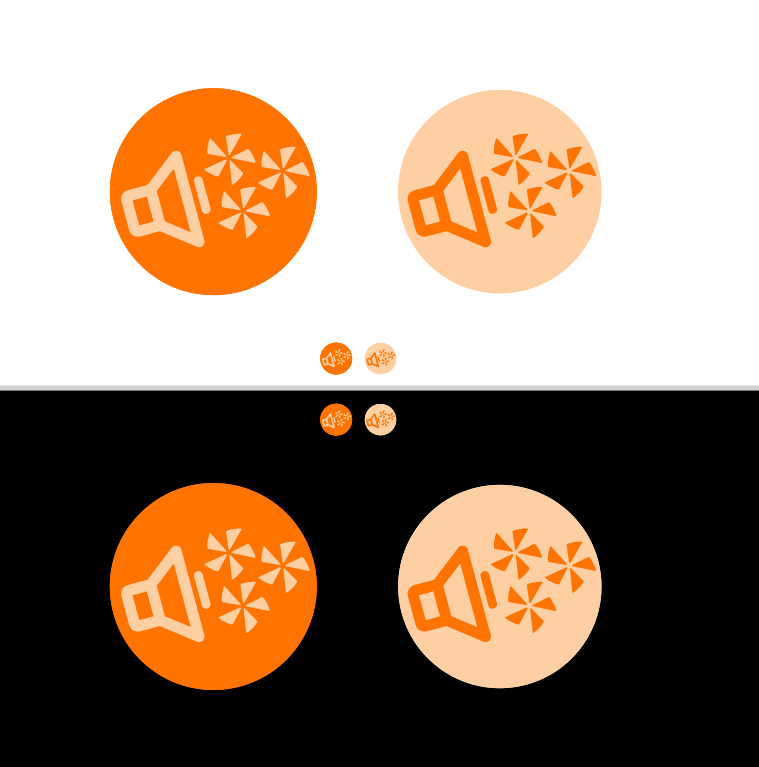
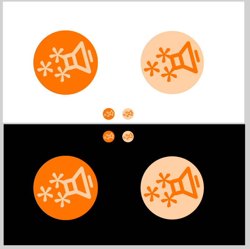
Interesting that it gives difference meanings for the fedi symbol before and after the speaker. I think I prefer the first one, just cause it looks visually clearer to me that it’s a speaker and there’s stuff coming out of it!
This is the one, I think. Sooo pretty <3
2 Likes
Same! To me this is it. I like the speaker shouting fediverse. And the more intense version on the left. Don’t ask me why (what’s wrong with me?) my first reaction seeing the version of the right was “Mandarina Duck”. ![]()
2 Likes
these first gut* reactions are golden. especially after so many iterations when you just don’t know anymore.
ok, i’ll finish up the right one, with “speaker shouting fedi” in 120x120 & 1:3 versions. in svg and png formats. and then we can start making stickers and stencils.
edit: and, thank you for all the invaluable feedback and cheering too, thanks mel!
2 Likes
final files are here:
@icaria36 please take a look how they fit. maybe they need adjustments. but i tried to follow instructions.
Oh – I went with the full name of the site… the way i’ve seen on OSM example. i felt maybe we can use that anyway instead of soc:music:net?


3 Likes
Refresh your browser and check!
on dark theme, it’s still the light header. so for the dark themes it should be “soc_music_net_logo_final1_120x560_DARK”. maybe there’s just one header for all themes?
for all themes 120x120 logo is the same. with dark orange background.
oh, and is it too close to the edge so that circle is a bit cut on top?
1 Like
Check now. I was still on it. ![]()
1 Like
Maybe the margin between the logo and the text can be a bit smaller, which would allow the font size to be a bit bigger without increasing the total image width? It feels (to me) they are a bit too separate anyway.
ADDED: we could have the same margin than between the 120x120 logo and the titles:


(((I have reduced the title of this topic to the logo only. If we want to discuss the theme / color schema, we can do it in a separate topic, leaving this one for the logo only: Colors and themes)))
@icaria36 new files on the same location (final2) svgs
1 Like
@prinlu Refresh. Perfect! ![]()
1 Like


Ahhhh…I had thoughts… too late! haha. Well done
3 Likes
nice!! i love it!
what’s the font?
1 Like
We could have a page (a new topic) with all the details about the logo and all the versions @prinlu has produced, ready to be downloaded and reused.
1 Like
the font is IBM Plex Sans.
very nice font! thanks!
the ratio between line-height and kerning is making my fingers curl, waiting for the lot to expand vertically or compress into a supernova, accompanied with a relieving “boop” sound.
so i did something about it…

My fingers will be fine either way
1 Like
oh it’s a svg. ok will try to amend it to my file. thank you.
2 Likes