You can see the square-rectangular logo image switch if you scroll up & down these topics:
In this one you can see the jump I was referring to, which can be avoided keeping the same logo margins for both versions on the left, top, and bottom:
You can see the square-rectangular logo image switch if you scroll up & down these topics:
In this one you can see the jump I was referring to, which can be avoided keeping the same logo margins for both versions on the left, top, and bottom:
SocMusNet? soc::mus::net? invoking, besides Rust, another throwback to the pre-emoji era where some people used to use double colons for the balanced typographical effect
instantly parseable when there’s at least 3 of each, and less chance of confusion across languages - “mu” can be many things besides music 无
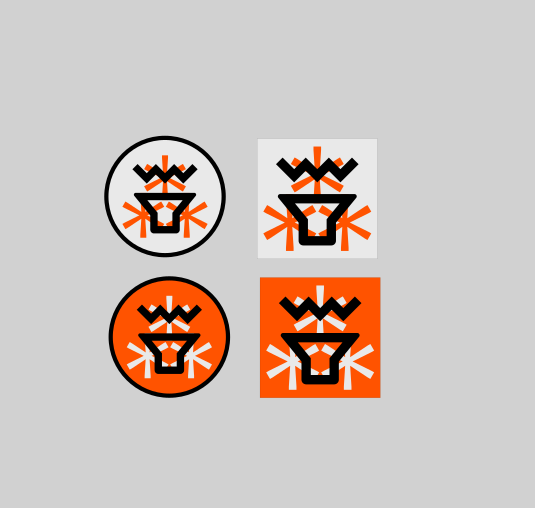
the orange used felt a bit too ‘faded’, so i went for the slightly more darker version and desaturated the ‘light’ color. this has more ‘power’. and i bolded the stroke of the circle. but maybe it’s all too much?
I love this! I have an idea how to simplify with one colour… hang on I’ve a bit of time this morning…
@Mel I like it! Simple, clean, memorable, and it works in multiple sizes. If you can spray it quickly in the walls of a corporate building, it’s a good logo! ![]()
Two details (one very important):
What about the orange as default and that green @prinlu selected above for dark mode? Just for the fun of it.
Yeah it’s weird, the Fedi logo looks different with each font…
That one was ‘Segoe UI Symbol’.
Spot on with this criterion! ![]() Good idea @Mel. TIL:
Good idea @Mel. TIL:
⁂ is a typographical character, not an icon that needs to be inserted as an image. Unique-looking, but standardised. This means it’s very easy to copy-paste around! Its design style also automatically adapts to the font used where you insert it. – fediverse symbol ⁂
Interesting approach, I can see this going places. Just gonna leave these here if they’re gonna be any use to anyone:
Ok, this is very cool. Well, don’t ask me why, but I like the 5-leg version way better. I can see it more prone to polyrhythms. ![]() If you like it too, we can stick to it.
If you like it too, we can stick to it.
However…
We should use a font with a free license, for legal reasons and to be aligned with our values. I mean, I don’t think anyone will sue us after identifying the font family by looking at the logo, but I believe all of us will feel better forever if whenever we look at that logo we don’t get a GAFAM reference in our minds. ![]()
Well, maybe, but not urgent or really necessary. The bootstrapping ends tonight, and then we’ll start a more calm beta phase. If you/someone could provide the square and rectangular versions of the logo, then I can add them, and we can fine tune if needed.
Square
Use a square 120 × 120 image
Rectangular
Use a wide rectangular image with a height of 120 and an aspect ratio greater than 3:1
SVG if possible. We need transparent background and zero pixel margins (the icon touches the canvas frame). Orange version for sure, green version nice to have.
Oh, for the rectangular version we need to resolve the words problem. Based on @prinlu and @unspeaker comments above, I suggest
soc:music:net
Not cutting “music” so it’s very clear what this is about. “soc” and “net” are abbreviations that are popular to a certain degree, or at least not critical if you don’t get them immediately. Here too we could change if better ideas come. But good enough for a beta?
I like the 5-leg version
challenge accepted
We should use a font with a free license
is the SIL Open Font licence ok?
If you/someone could provide the square and rectangular versions of the logo, then I can add them
ok will finalize it then today.
soc:music:net
Not cutting “music” so it’s very clear what this is about. “soc” and “net” are abbreviations that are popular to a certain degree
makes sense! agreed.
SIL Open Font License - Wikipedia says:
The license is considered free by the Free Software Foundation (FSF)[2] and the Debian project.[1]
Alright, Sawarabi Gothic is the only one I’ve found that does the 5-point non-bulbous version of the symbol. It won’t let me upload the SVG here, haha
Not enabled by default. Can you try now, please?

Success! What a beautiful SVG it is.
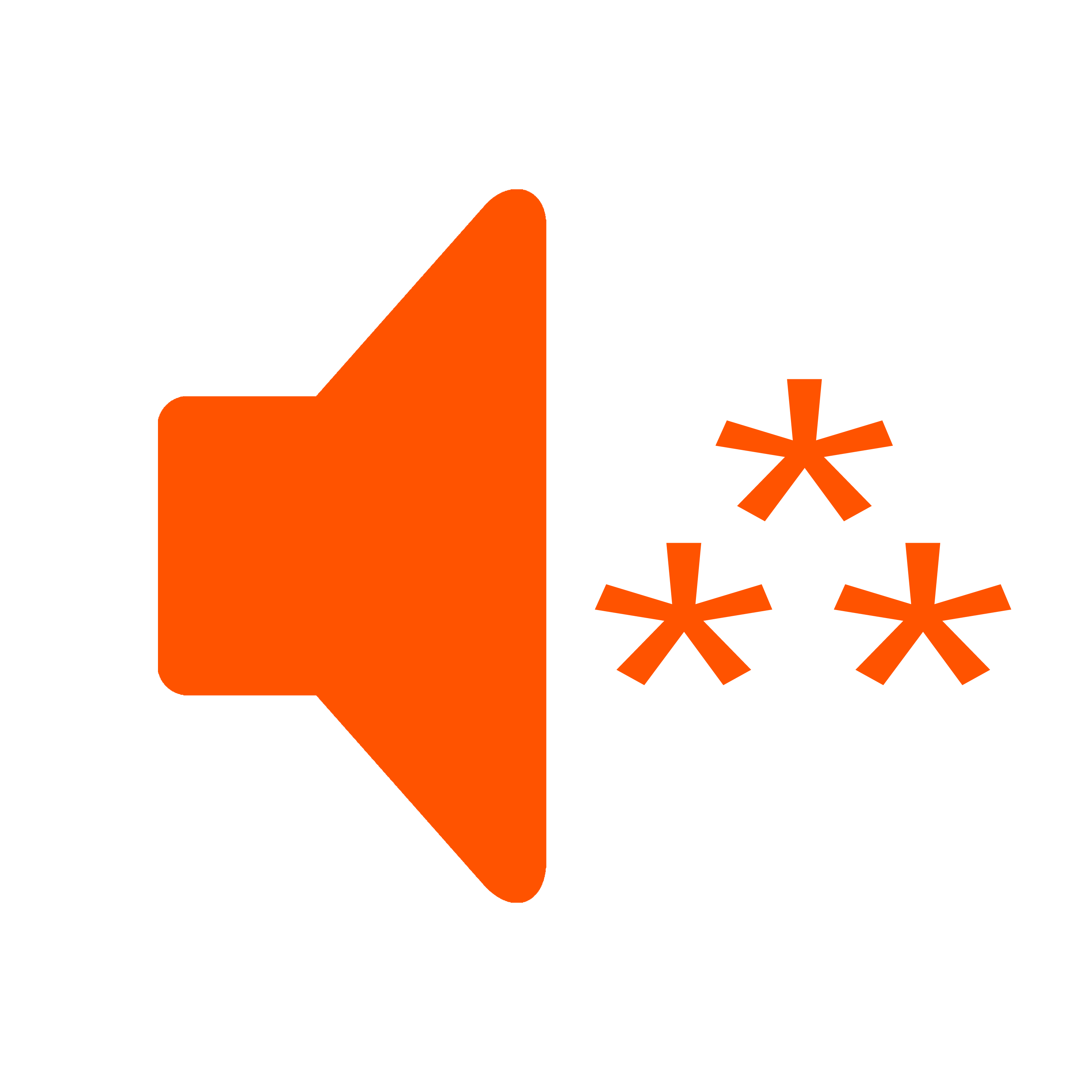
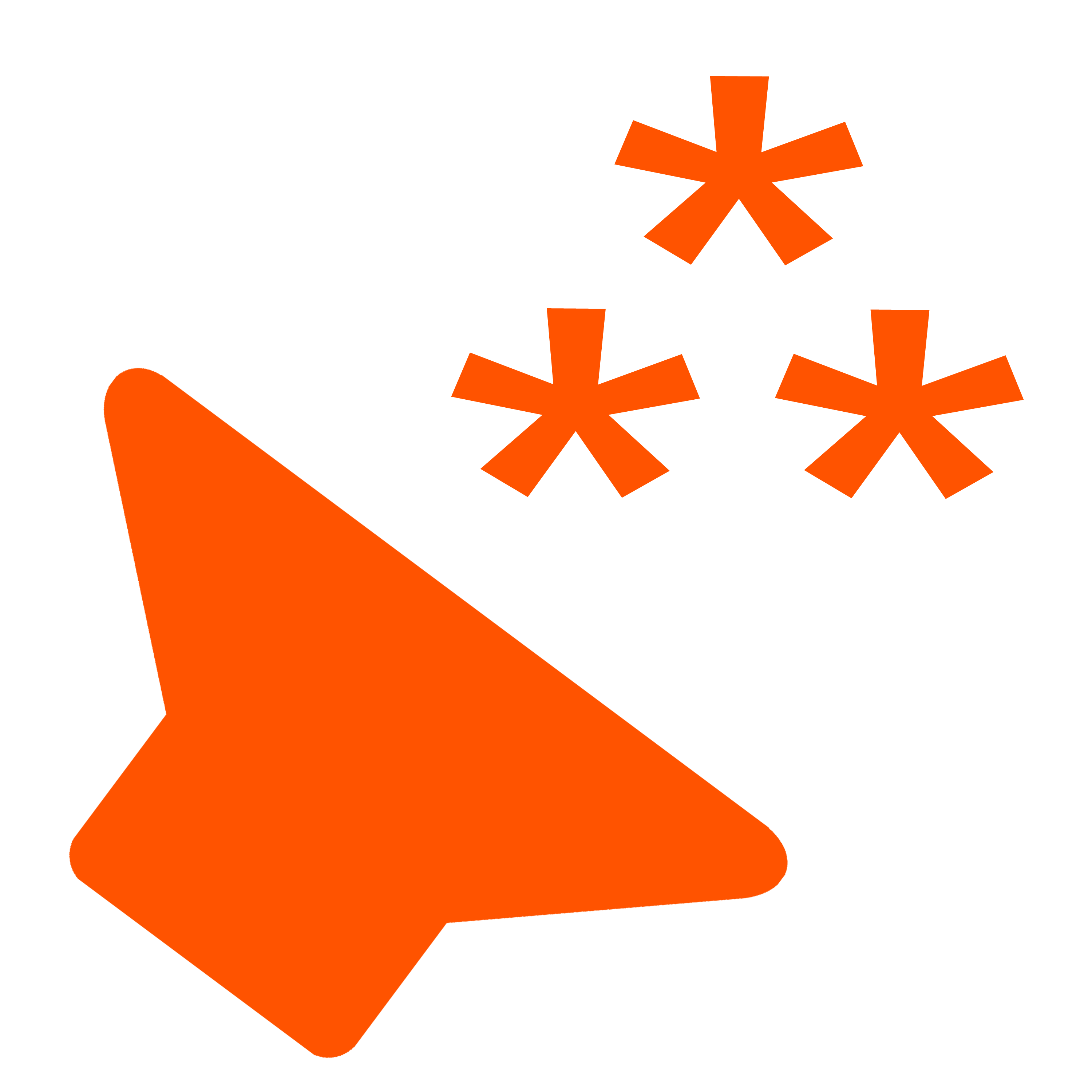
I’ve got an idea to (perhaps) fit more logo in the same 120x120 box. And maybe looks more dynamic as well?
What if we tilt the speaker 45 degrees to the left, let it sit on the bottom left corner, and then align the asterism to the top right corner?
Two variants to try: no tilt in the asterism and, and 45 degree tilt to the right (which I believe would give more a feeling of “speaker reproducing Fediverse sound”).
I’m sorry that I’m quicker with words than sketching, when clearly here it would be more useful the latter!
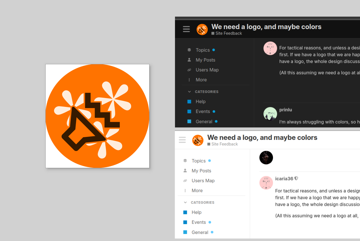
my almost final proposal…?
i have tried a lot of different fonts all with 5 legs.. i had asterixes that were more edgy, almost like shurikens, but i wanted conceptually some softness.. so in the end i used those that are almost like flowers - connoting the kindness of creating a community, but the vibration from the speaker is much more edgy and rough, because at the end of the day, although we are doing somewhat radical politics, it’s the musical output that makes society change. or it’s also both.. but I feel we need to be empathic but we can afford violence with air pressure fluctuations (= sound/noise/music).
Just to throw another idea in case…
And the Play icon with the asterism inside?
i’m not sure, since the play icon implies the listening / playing / streaming of a final recording while speaker to me is closer to all different activitis, listening, making, composing, performing…