Note that color schemas are easy to change – some technical restrictions apply.
Note that there are a bunch of official and community themes, and also a powerful theme engine.
At the same time… it’s not a bad idea to start simple and implement visual improvements as we need them. Heavy customizations are risky, both in terms of taste and sustainability (especially community themes are more prone to break in the long run with software upgrades).Anyway, ideas and proposals welcome!
First one I’d suggest would be to remove the border-radius from the pfps - and increase their size to at least 72x72 if not 96x96, so that people’s identities are represented by something more than a vague colored dot.
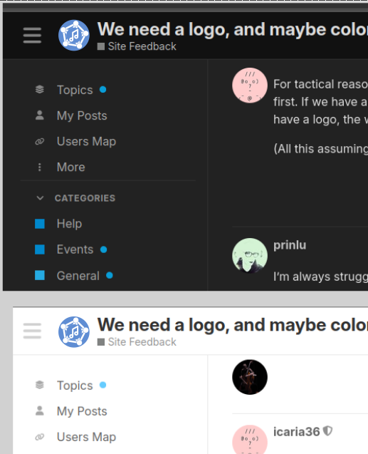
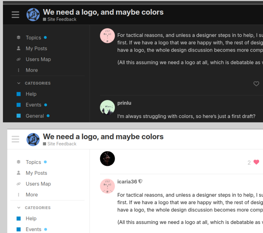
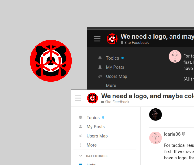
For tactical reasons, and unless a designer steps in to help, I suggest we focus on the logo first. If we have a logo that we are happy with, the rest of design work is easier. If we don’t have a logo, the whole design discussion becomes more complex.
(All this assuming we need a logo at all, which is debatable as well.)
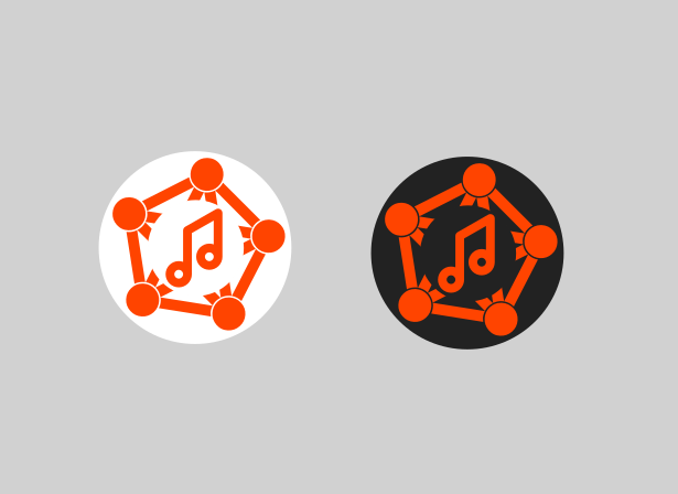
It works visually! Pretty, and balanced. Conceptually on the other hand… it looks like i see spotiface : A large blob that inserts itself in between the peers of a network. Frocing the peers to circumvent it and become each others’ gate keeprs
edit: hmm.. that was maybe a bit harsh… I don’t mean to bikeshed and i have nothing better to propose.
Thank you @prinlu! I’m very happy to see movement in the pixels area.
Thoughts:
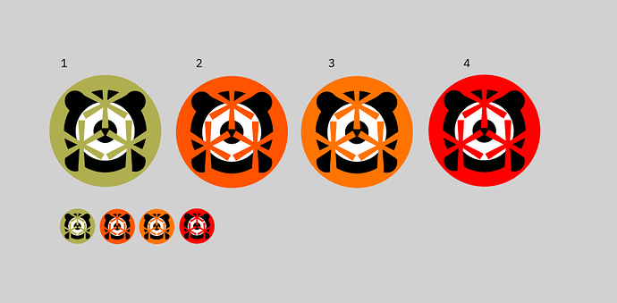
Colors. It’s all personal taste, but the high contrast and energetic orange appeals to me more than the peaceful and calm blue.
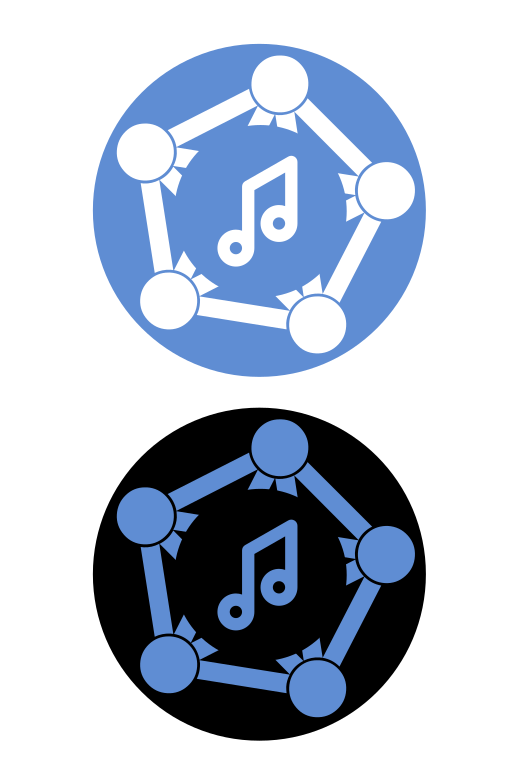
I like the combination between “music” and “something else” for our logo.
“Music” represented by a musical symbol never gets old, right? I have no opinion about the symbol and its design as long as whatever we take comes with CC0, public domain or non-copyrightable geometry.
About “something else”. Hmmm… Ok, the Fediverse is a good candidate. I’ll note that when I made initial contact with some peers, I had registered the domain “fedimusic.org”, and the feedback I got was that it would be interesting to have a wider scope. This is what led me to go for “social” + “network”, and in the past days we have been talking also about “autonomy” and “fairness”. There is no logo for these concepts, and one could say that the Fediverse embodies social + network + autonomy + fairness. Therefore, my personal opinion is that the Fediverse logo is ok if nobody comes with a better idea.
About the Fediverse logo… Fun fact, I was involved in the collaboration that led to the pentagram depicted here. However, recently an alternative logo has been proposed, and I think the proposers are right.
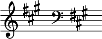
This asterism reminds me to the three sharp symbols in A major (Autonomy!) or F-sharp minor (Fairness! Fediverse!)
I don’t know about a treble or bass clef feeling contemporary and forward-looking in 2025. Then again we don’t have to compress a lesson of music theory in a logo. We can just stick to the 🎜, add the ⁂ at the top right, and be done with it?
i was thinking about asterism too. and maybe speaker and/or vibration (of air pressure) as something more representative of wide range of (non)tonal sounds that we consider music today. will get back to it all a bit later.
here’s the next iteration. i’m not sure about this… still needs some work around colours. maybe it’s even bad on accessibility, too dark? no contrasty enough?
i like to top one how it create a joined space of stars with background…
I like the color combinations a lot! Also the idea of a speaker with the asterism inside.
But this combination… somehow brings me some anxiety / claustrophobia. Ok, I’m exaggerating, but I think the overlaps aren’t working well to identify a speaker and a Fediverse logo. The brain (mine at least) has to work too much for a logo. But if people like it, no problem!
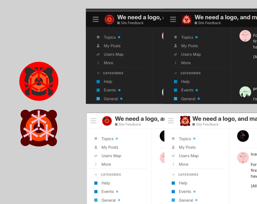
I tried (with my very limited GIMP skills) to steal another type of speaker and place the asterim inside the big membrane, so that both elements are clearly identifiable.
yeah i can actually see what you mean. it’s very monolitic, very circular and symetric. dare i say it veers into some kindof fascist vibe.
the problem wth your suggestion is that i’m afraid it doesn’t translate to small version that well.
i was also thinking to try with some icon depictions of vibration. I’ll try some more. thank you for all the feedback! at least the colors are in the right direction.
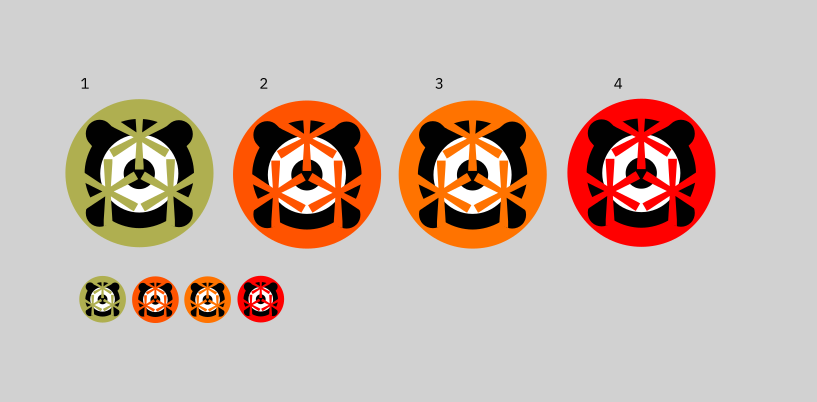
I think you could still try (just to see how it looks) to scale down the asterisms in these images so that they fit within the white circle. Just make the asterim layer smaller, don’t touch the speaker in the background. There is a chance that the bigger image is enough to recognize the Fediverse logo (for those who know it anyway) and I don’t think recognizing it in the small matters much, because it will be recognizable for the overall shape and colors regardless.
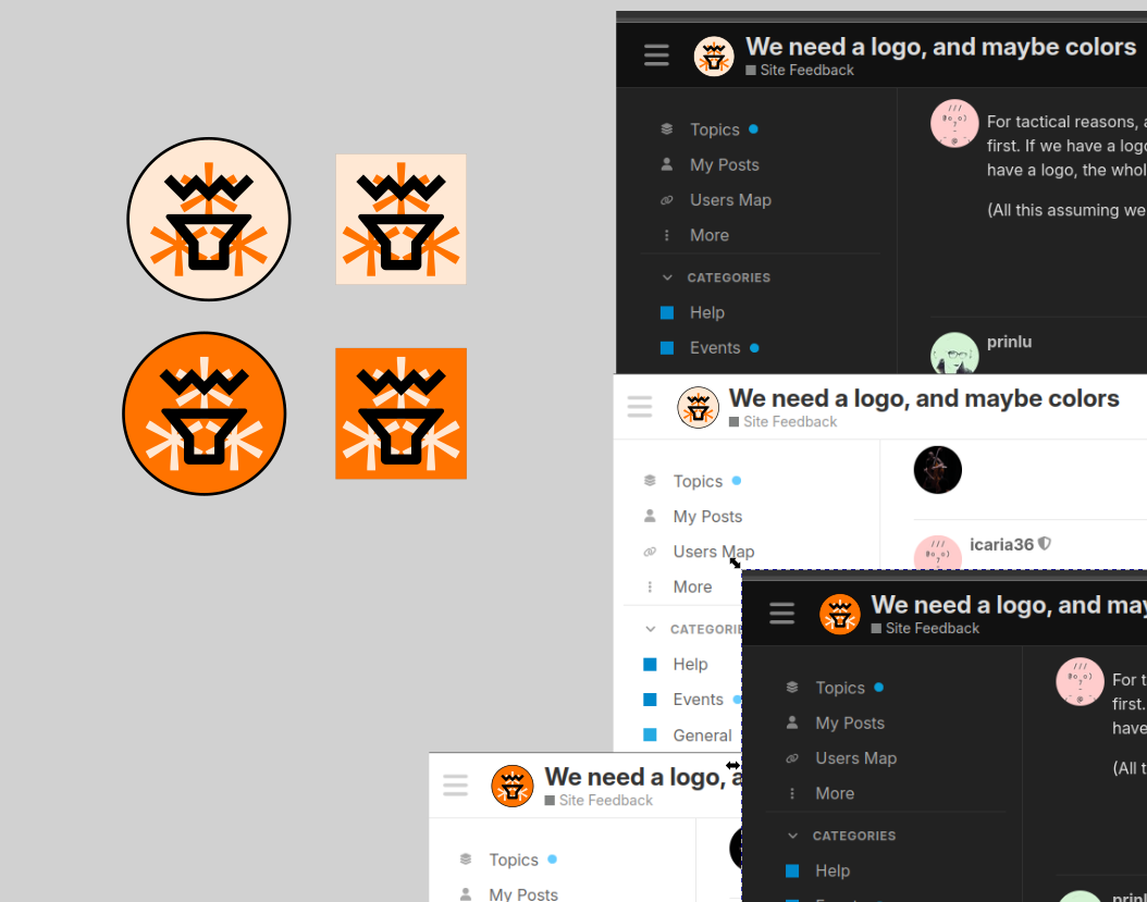
I like @icaria36’s logo proposal! The “Genelec”-shaped speaker is nice and instantly recognizable. Given what space there is to work with in the header, a logo with 1:1 proportions would probably work best, though, so, riffing off the last proposed variations to @prinlu’s work:
Why entirely blend the asterism with the circle background? Some fine outline, drop shadow, or simply a darker background, to make the fediverse logo stand out a bit more, would make it instantly recognizable in both large and small sizes – even if it doesn’t matter that much for the small one.
As far as colors go, the warm and lively hues are great, #2 looks freshest, I guess? Meanwhile the green would make a great highlight color (--tertiary) in the site scheme – the current “default internet blue” (as seen in the reply form, all the links, notifications dots, etc. etc.,) is kinda meh.
“Social Music Network” is too long for a header and also for a project name to be repeated by 1000s of people. Inspired by SoNoMu, we coukd use “SoMuNet” or “Somunet” in the header next to the logo.
“Social Music Network” will be visible on the pinned top post title (I will edit it) and the URL, which eliminates the need to spell out the three words a third time.
Note that the text in the logo needs to be added to the large version.
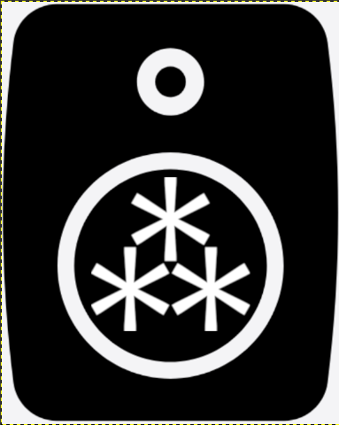
The logo image at the top left of your site. Use a wide rectangular image with a height of 120 and an aspect ratio greater than 3:1. If left blank, the site title text will be shown.
The small logo image at the top left of your site, seen when scrolling down. Use a square 120 × 120 image. If left blank, a home glyph will be shown.
The 120x120 square on the left must have the logo in the exact same position. This way it doesn’t “jump” when scrolling long pages (this is when the rectangular logo is swapped by the squared.
Also, we can have a default logo and a dark mode logo. Given how cool the colors of the last drafts are, I think we could have different colors for default and dark.
I really like the “Social Music Network”, this full name, but of course, we can only have as much space as we can. I’m a bit warry of SoMuNet, or Somunet - at least for me, “SoMu” kinda pushes me to see it as “Sound Music” instead of “Social Music…”. I’d rather perhaps try with SMN, or Soc.Mu.Net? dunno.. soc:mu:net ? soc://music.net ?