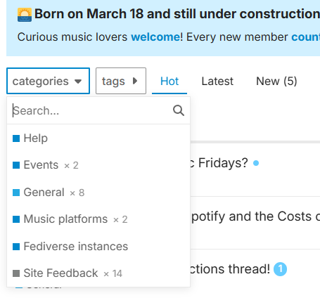
Improvements to the (sub)categories' pages

Categories view

Nice updates to the categories page!

and I believe admins can configure the default view as well

Strongly in favor of defaulting to categories view. What some old-school forumites suggested on Beyond Faircamp seems to be called Categories with Featured Topics. Is this worth a try?


Cool bugs I found

Looks like a Discourse bug to me

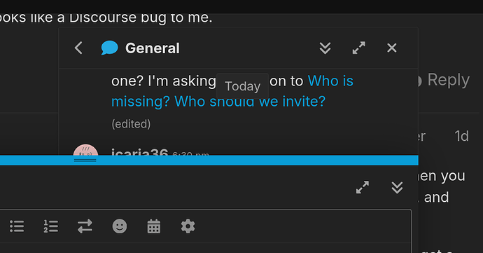
Yeah. It would make more sense for the Chat and Reply popups to be side by side (like multiple chats worked back when I was on Facebook.) Or at least for the chat to stretch - instead, it… overlaps? Can get detached from the right side, too, depending on zoom level:

screenshot

Not a biggie, just strange they let it through. Just makes me curious whether they have completely separate people/teams working on both features…

There are few interesting ones with the post editor:

  • Can’t open a certain saved draft from My Posts. Points me to the thread, doesn’t open the editor with the draft text. (I’ll just ditch that draft, the points in it have been already made.)

  • This one:

Even got me in a confusing redirect loop where it would pop up after reload (when choosing “Refresh”) or a few seconds after picking “Ignore”. The behavior of the editor even when it works correctly can be counterintuitive, but … :person_shrugging: eh, whatevs.

At least we have multiple drafts. Looks like this has also been added recently and I’m really thankful for that – woulda been very annoying if it didn’t let you write separate replies in separate tabs…
The users we want to attract are music lovers hopefully young and rebel (or at least middle-aged and nonconformist) :wink: who have Instagram, X, Facebook as main references. The Categories page brings some comfort to newcomers because they act as a map, but those categories get quickly in the way because they are static content taking a lot of space. This is why we won’t have them as default for everyone.

Categories with Featured Topics was the configuration we had for the Categories page, because this is the one Discourse has by default. But @AxWax complained on Beyond faircamp that even the categories page had a list of topics. I found that objection very sensible. There is a Latest page already for those who want to see Latest, and now we have a Categories page with just categories. Makes sense.

And users can find their Drafts under Profile > Drafts.

The users we want to attract […] have Instagram, X, Facebook as main references

Thanks for clarifying that. It’s good to have it out in the open.

Categories with Featured Topics was the configuration we had for the Categories page, because this is the one Discourse has by default. But @AxWax complained on Beyond faircamp that even the categories page had a list of topics. I found that objection very sensible. There is a Latest page already for those who want to see Latest, and now we have a Categories page with just categories. Makes sense.

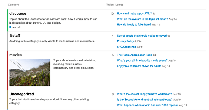
So, Categories with Featured Topics does not provide a list of categories with featured topics per category as in the screenshot I linked to?

Screenshot 0. Categories with featured topics

If I remember forums the same way @AxWax and @sknob remember them, this type of view was what was meant in that conversation?


And users can find their Drafts under Profile > Drafts.

Sure can. I can click here:

Screenshot 1. This one works

and I get sent to this thread, with the post which I’m currently writing open in an editor. And it worked just fine for all my other draft posts that I published or discarded… except for one:

So, if I click here:

Screenshot 2. This one doesn't

I get sent to the thread, but the contents of my draft are nowhere to be seen. Hitting “reply” just gives me an empty editor.

So, the second draft remains in limbo. It’s a bug, probably originating from Discourse platform trying to facilitate users an overly complex way. I suspect it happens when the draft is in reply to a post that has since been split off into another thread? Not much to do about it, I guess :person_shrugging:

Sorry, my mistake.

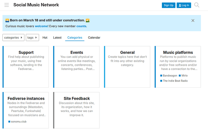
This is how the Category page looks like with Boxes with Subcategories.

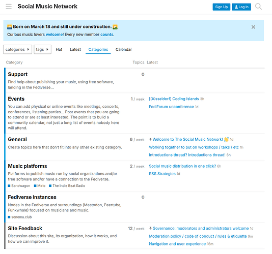
And this is how it looks with Categories with Featured Topics.

I don’t think the latter beats Hot, Latest, or even Categories (Boxes with Subcategories), because it tries to make happy several use cases and ends up (imho) failing, when the other options, specialized in their own thing, are just a click away.

1 Like

Sure would be great if all of these modes, or at least as many as the admin decides, were available for the user to choose – rather than just having one variety of the “Categories” page decided for everyone regardless of informational metabolism.

I don’t think the latter beats Hot, Latest, or even Categories (Boxes with Subcategories), because it tries to make happy several use cases and ends up (imho) failing, when the other options, specialized in their own thing, are just a click away.

I understand if you see things this way. The decision is yours. I do believe the typical power user (so, someone who would be invested in their participation in a community!) expects a “forum homepage” to look pretty much like “categories with featured topics”.

I was glad to see that others on Beyond Faircamp had similar reactions to mine and I was not the “odd one out”. If one sees something called a “forum”, but it looks nothing like how one is used to seeing a forum, one’s liable to be like “who knows how many other things here work counter to my intuition”, and miss out on the opportunity to connect.

I, for one, see “latest topics by category” as an essential tool for intentional exploration - and the displaying of multiple latest per category in fact improves on prior forum platforms.

The descriptions in “boxes with subcategories” are also cut off for 4 out of 6 categories. Which again ties into the “short attention span” assumption about the target audience that seems to be implied about users from FB/IG/X/etc – and verges on self-fulfilling prophecy territory: can’t get used to making intentional, independent choices, if information is always presented to you bite-size. Or something.

We have higher resolution screens than ever, and yet less and less things are actually displayed on them – is it really surprising that it’s becoming more difficult for us to understand each other?

1 Like

Ok, I’m very happy to let the “Categories members” decide the type of page they want to have there from the options available. I’m also happy trying any theme components or modifications that Discourse can do.

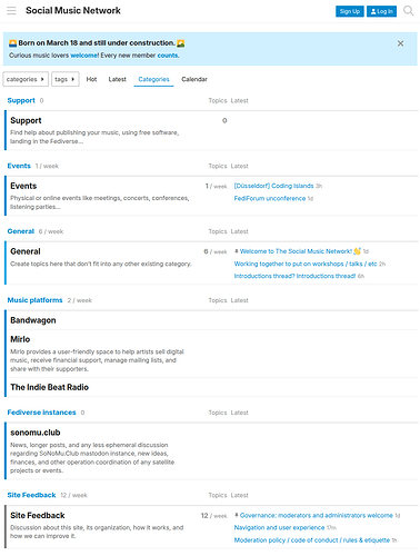
What about Subcategories with Featured Topics? Please check.

2 Likes

This looks good, and exposes the contents of the subcategories! :+1:

The previous “top-level categories” view looks somewhat more visually coherent. Does Discord provide you with an affordance to easily apply custom CSS? I’d be happy to provide some minor tweaks that make the latter one look slightly less jarring.

I just noticed, however, that all categories views, seem to suffer from the same problem: when you open the top-level category, you don’t see a list of the subcategories. One would expect them to be represented the same way as on the “categories homepage”. There’s a “subcategories” button in the breadcrumb, sure, but again the user is served less information than they would expect to see.

I’m about 50/50 on which of the two options look better to me. Both, unfortunately, have some pretty obvious deficiencies, and in both cases people are somewhat likely to miss out that top-level category may contain threads.

Some options to have in mind if it turns out that all available categories views come with significant drawbacks:

  • eschew categories entirely
  • eschew subcategories, moving present subcategories to top level
  • prevent posting threads in those top level categories that have subcategories?

I’ll check if there are well-maintained components that provide a more comprehensive categories view.

Yes, and we can try to add improvements this way.

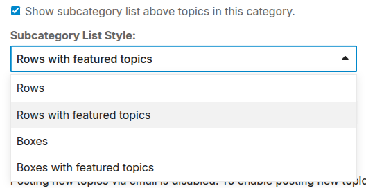
There is a configuration for this. Please choose one, or I can take screenshots of different options.

We can also decide whether being in a top category shows only a list of topics in the top category or include the topics in subcategories as well.

Categories are like “hard tags”. They are useful for users to quickly identify topics, also to set their preferences on entire section of the forum (from following every single post to mute them altogether). In the backend, admins can also set priority levels for search at a category level. That’s pretty much it.

As said, very useful for newcomers to understand the map, but after that… I don’t think users check the (sub)category pages much once they establish their routines. I believe not even old-school forumites will check them on a regular basis once they are settled.

Said that, I welcome all the feedback to improve the category-related pages, so thank you for your patience here @unspeaker. :slight_smile:

1 Like

And likewise thank you for yours! It wouldn’t be right to expect you to just magically fix things that weren’t implemented in Discourse in the first place – but I see they do in fact offer the right options.

My suggestion would be to default to “rows with featured topics” + “show subcategory list above topics” for every category - it’s what most other forum systems (that I’m familiar with) do.

As said, very useful for newcomers to understand the map, but after that… I don’t think users check the (sub)category pages much once they establish their routines.

I’m not so sure about that. Why have a map one can’t easily follow? Fundamentally I think it boils down to a “push” vs. “pull” model of interaction. Consider:

from following every single post to mute them altogether

  1. I’m wondering what the points between these two extremes could be. Follow/mute posts by tag/keyword?

  2. This is still all “push”. If there’s one great harm that FB/X/IG/etc has done to the way people consume information, it’s normalizing “push-only”. Feeding content to people in assumption of their preferences was what eventually let them dictate people’s preferences. I think it’s worthwhile to enable “pull”, i.e. intentional browsing-based workflows.

For example, say someone hasn’t been to the place for a while and wants to see what’s new in a given category. Or they don’t like to receive more notifications. (I read someone mention something about mailing list mode of email notifications – if this is enabled I should probably try that.) Or something else entirely – my point is that you can’t, and don’t need to, anticipate everyone’s workflow.

Some tools are better for enabling people to have whatever suits them best; others facilitate the majority at the cost of hampering the minority. In my view the former kind of tool is strictly superior. (I’m willing to accept many other drawbacks of a thing just for the sake of having the thing not dictate to me how exactly to use it. I assume a lot of independently-minded people, whether their focus is music, software, or organizing, like to make the same tradeoff.)

Categories are like “hard tags”.

Categories vs. tags, vs. nested tags, can be a whole another discussion, one that may be out of scope for technical reasons. There are ways to make the whole system better but we’re making do with what’s available. In the end, any system for intentionally organizing conversation threads, however imperfect, still beats no system at all (like a chatroom), or worse, a system based on an AI feeding people finely tuned emotionally triggering misinformation (like a recommender). I’m thankful for that.

1 Like

My gripe was that the page was dominated by a list of ungrouped topics from all categories.

:100: Yesss, IMHO that’s the only one of the discussed views that gives the user the agency to choose what they would like to read.

That’s definitely the closest to what I’d like a forum to behave.

Yeah, it could be better, but it’s workable (and could possibly be improved with a bit of CSS love?)

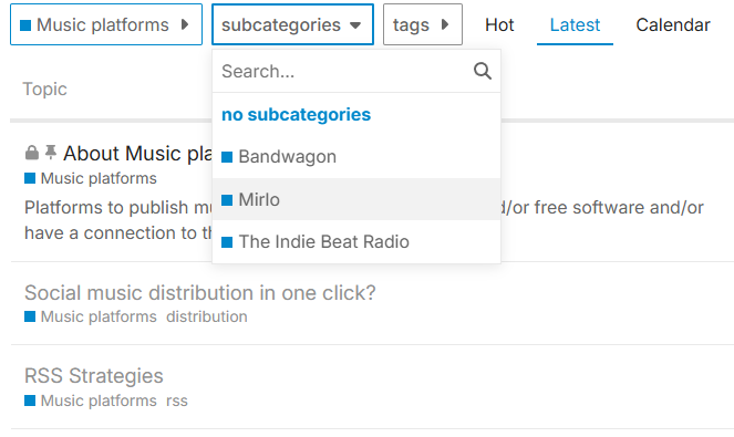
Yeah, surely when I click on Music platforms anywhere I should be able to see posts about Mirlo, Bandwagon etc, or at the very least an indication that those subcategories exist.

If I’m on the home page and click on the categories drop-down there is an entry “Music platforms”, but none of the subcategories. And nothing on the resulting page either. I can’t imagine anyone who isn’t versed in the ways of Discourse to realise they then need to click on another dropdown (subcategories) to even find out that these exist (and then visit each of these to find out if they contain new posts).

clicking on music platforms leads to–>

On a side note: Why is there a Calendar entry on that menu, but no Categories (or eg new/unread posts) entry? I think either of those would be much more useful than a calendar link when you are inside a category page.
image

Sorry I wrote the above before your reply - sounds like this can solve some of my gripes above :partying_face:

Well, if the topics from subcategories are/were shown in the top category then the main point of checking subcategories is if I’m eg only a Mirlo user, but don’t really care for Bandwagon. Or am I misunderstanding something?

As it stands I find it extremely cumbersome to navigate between different (sub)categories or topics within, mostly due to the lack of a breadcrumb bar in the traditional sense (ie home|category|subcategory|topic), so this is essential for me to mitigate that.

Spot on!

Btw, thanks for all your work and patience @icaria36 - this has already seen a huge improvement in a very short time span!

2 Likes

Full breadcrumbs seem to be another lost technology :sweat_smile: I found a theme component which adds those. Last updated ~4 months ago – so, reasonably well-maintained I guess?

Thread: Breadcrumb Links - #19 by nolo - Theme component - Discourse Meta
Repo: GitHub - denvergeeks/discourse-breadcrumb-links: Breadcrumb Navigation for Discourse

Done: see #music-platforms and #fediverse-instances.

Of course, we “just” need to have actual topics in those subcategories to see how it will actually work.

For what is worth, it is possible to prevent that topics are created in categories with subcategories, so that anyone posting on i.e. #music-platforms should have to choose a subcategory.

I have removed this dropdown because I think it adds to the confusion. Members can use the sidebar for this, and even customize it with their preferred categories and tags.

I’ll look at this tomorrow after a good sleep.

The breadcrumb navigation is about jumping on a post and back to (sub)category, next post and back… and when you are done with a subcategory back to the category and jump to the next subcategory…

Discourse saves a lot of back and forth by offering your likely next topics below the topic you are reading, in “New & Unread Topic”

  1. If you have previously visited topics with new posts, these are offered first.
  2. If there are new topics in the current (sub)category, then these go next.
  3. Then, if there are new topics in other (sub)categories, these go after.

(or something like that)

So you end up doing basically the same scanning, but jumping directly from topic to topic.

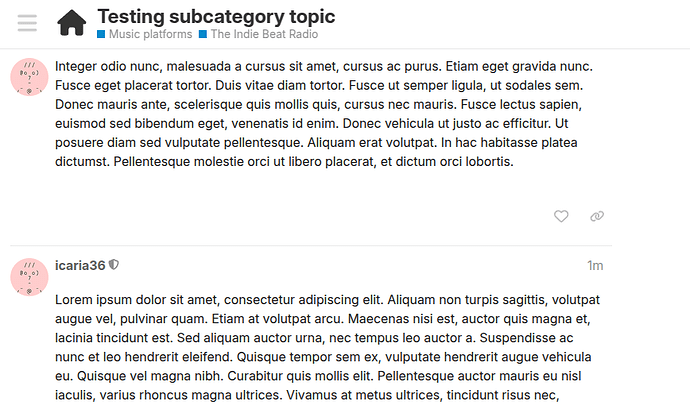
And well, when you are reading a post you do have a breadcrumb navigation, even if it’s not designed like in 1998. :smirking_face:

See the example below, which can be translated to

Home > Music platforms > The Indie Beat Radio > Testing subcategory topic

This is a community component, which means that the risk of being abandoned or broken with updates is higher. But more importantly, from the image shown in that page…

Home, Lifestyle Tweaks, and Seniors are repeated just a few pixels away. How is that duplication an improvement?

Actually, I found the page: About the Seniors category - Seniors - nđź‘€bish.me

Lifestyle Teaks and Seniors are linked a third time in the sidebar.

I suggest we iron out the last couple of details still open and then let this conversation about categories rest for a couple of weeks. By then you will have used this forum more time, hopefully we will have topics in subcategories, we will also have more users, and maybe we will have better elements to see what settings facilitate the majority at the cost of hampering the minority. :slight_smile:

1 Like

Indeed, it’s not much better. It’s only an improvement in the sense that it’s visually identifiable as breadcrumbs, by virtue of looking like any other breadcrumb component ever – instead of looking much more like, as you said, tags :person_shrugging:

Meanwhile the categories in the collapsible sidebar are just customizable shortcuts – they are not an indicator of where the currently viewed topic is in relation to the rest of the forum. That’s the functional difference between categories and tags, thus the reason they should’ve made them visually distinct in the first place – tags can’t be part of a breadcrumb.

(But oh no! That’d be too many concepts! Which would confuse people! So let’s keep them, but make them look the same – you know, to prevent confusion :grin: That’s how I imagine that decision must’ve went.)

Were it up to me, I’d keep the top breadcrumb and ditch the one below, but if there isn’t any setting for that in core, well I guess you could say it’s not an option :older_person:

Tbh I have the same reservations about poorly maintained third-party components.

There different types of tag styles available out of the box:

And I believe there are even more through theme components, and then there is CSS.

Which again answers some completely different point to the one I thought I was making – or do I misunderstand and these tag styles in fact apply to the categories breadcrumb, or something like that? – but I’d completely understand if you think other concerns take priority and would prefer to dedicate time to those instead! Thanks for providing us with a workable categories view, let’s see where it goes from here.

Tags are tags and categories are categories.

That’s not because they’re listed on different pages. They’re different things because they accomplish different purposes. The way they are displayed in the topic header is counter to their purpose – indeed has already been demonstrated to cause a conflation between “categories” and “pre-defined tags”. I have already conceded that there might be no practical way to change the way they are displayed there.

Having to spell things out, only for what I say to be understood even less, does not bring a good “vibe”. And, evidently, accomplishes nothing. Thus, I find myself unable to think of a generally comprehensible way to point out the inappropriateness of such response as you made, without potentially being understood as entering a mode of speech which I’ve already been asked in private to avoid.

Thanks for a great lesson in weaponizing civility.

The horizontal navigation bar is context sensitive:

  • In the main page it shows Hot - Latest - New (if any) - Unread (if any) - Categories
  • In a category page, these links refer only to the category topics (i.e. you’ll see Unread only if you have unread topics in that category. The “Categories” link is not shown in these category pages.

I have removed Events and Map from the navigation. The sidebar has now a “Users Map” link, and there is a link to the Events category.

I have also listed all the top-level categories in the sidebar. It’s a short list and expected to be quite static. Note that logged in users can customize the list of (sub)categories they want to see, clicking on the pencil icon.

If you have new/unread topics in a category, a blue dot will appear. This allows you visit the categories where you have new topics and skip the rest.

I hope this satisfies your main concerns.

1 Like